What You Should Know about Responsive Web Design
- Oct 14, 2018
- Architechs for the Web
- Web Design Company
 If you’re looking to increase traffic to your website and convert potential visitors into customers, you must understand responsive web design. Since mobile website users are making up more than half of all website traffic, your website should be designed to look good on small screens and load quickly. In this article, we’ll cover the basics on responsive design and why it’s important for your website.
You Can’t Ignore Mobile Traffic
If your website doesn’t look good on a small screen, you’re losing more than half of your potential customers right away. If they can’t read the text or click on the links, website visitors will abandon the site immediately. After all, there are millions of other sites they could be looking at instead.
Mobile website traffic hasn’t always been this important. But if you look at the statistics, you can see that more than a third of all visitors were using mobile devices as early as 2015. Nowadays, mobile traffic represents more than 50% of all web traffic. Therefore, web design has changed by putting the emphasis on mobile first.
Emphasis on Mobile First
In the past, websites were created by web designers. They came up with the best layout and then the web developer implemented the design on the screen using pixels. The responsive design was usually the last step. Once the website was done, the developer would make the changes necessary to make it look good in mobile.
Of course, a mobile website should function differently than a regular site. For example, instead of having several links at the top, you’re usually relegated to one menu button. The images and headings have to fit underneath each other instead of being horizontally aligned. And if you don’t design with mobile in mind, it may be difficult if not impossible to turn your website into a mobile site after the fact.
Why You Need Optimized Images
When you’re designing a mobile website, it’s important to optimize every image on the page. While high-resolution images look better on every type of screen, they often take too much time to load. When you’re using cell phone data or a public WiFi network, you don’t usually have very fast Internet. And most people just don’t have the time or patience to wait more than a couple of seconds for a website to show up properly.
Optimizing your images ensures that your website loads fast. If necessary, you can even have the site load completely and load the images afterwards. While images are important to your website, your website visitors are probably looking for links or other information first. And that must show up right away.
HTTPS Is No Longer Optional
In the past, general websites didn’t need to be secure unless they asked you for personal information. For example, you would never give your credit card information to a website that didn’t employ HTTPS. Now, Google and other major players of the Internet are pushing for a more secure web.
In essence, that means two things for your website. One, Google is not going to rank you as high if you don’t have the coveted HTTPS encryption logo. Two, website visitors might even see a warning on their screen if the security encryption is missing. That means they aren’t likely to get in touch via your contact form or buy from you, because they don’t trust your website to be secure enough.
You Need Call to Actions
Every website needs CTAs or Call to Actions to get the user to engage further with your brand. These are usually buttons and links that encourage customers to “Call Now” or “Contact Us” today. Implementing the right CTAs can increase your website visitor interaction by 30 to 50%. Not only do you make it easy for potential customers to get in touch with you, you’re also helping them navigate the site and take the next step in the process of working with you.
Website Design That Stands Out
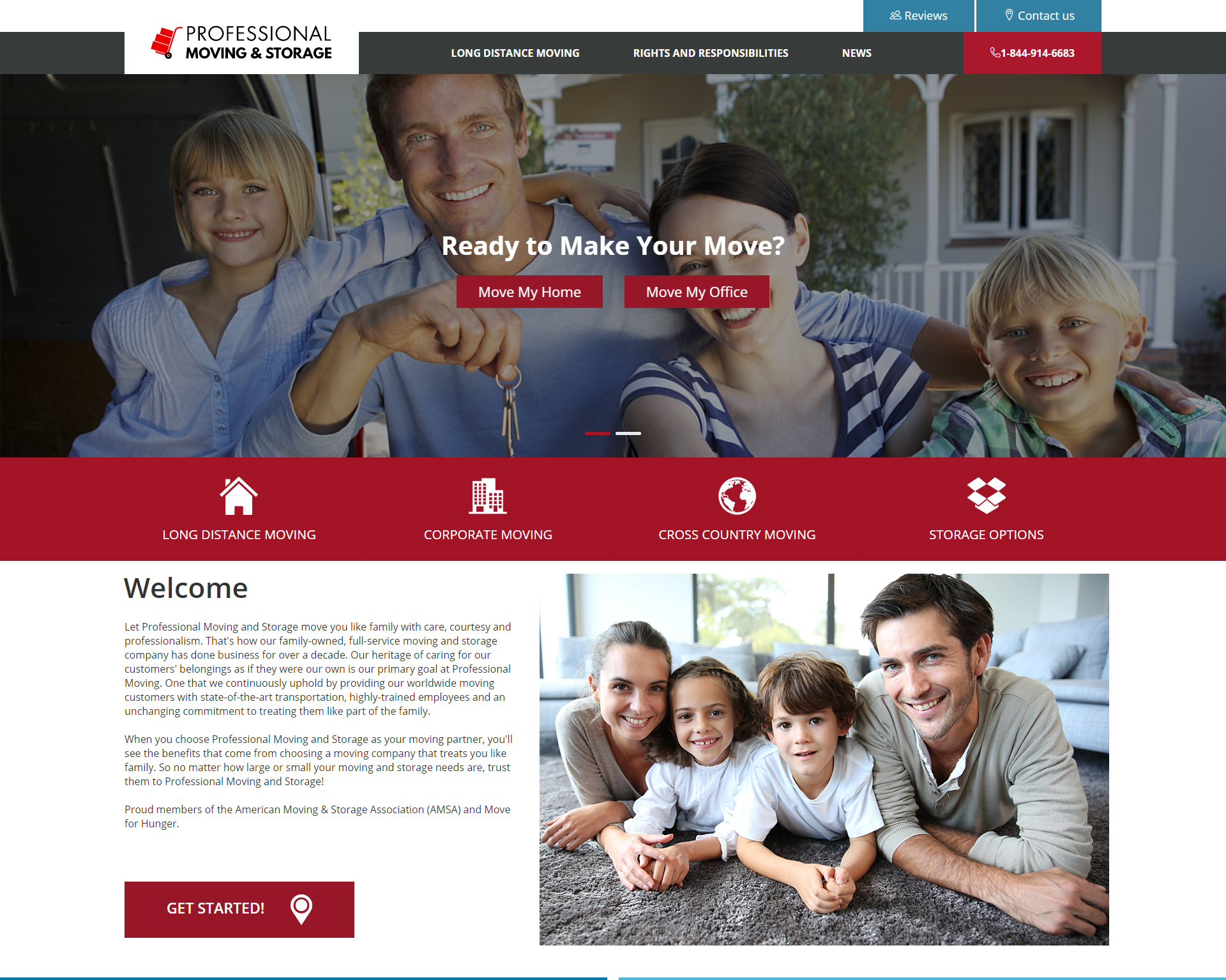
We excel in creating beautiful websites that are easy to use on mobile devices. Take a look at our most recent designs for a Daytona law firm and a moving and storage company. Their websites are designed for mobile use first, which is why they’re easy to navigate on screens of any size. We're also proud to handle the online marketing for these clients. If you have any questions about responsive web design, online marketing, or anything else web-related, please give us a call.
Enjoy a free SEO consultation by filling out our contact form on our website or by giving us a call at (386) 951-4770. We create amazing websites and our clients rank top on Google. Let us put our knowledge, expertise, talent, and tools to use for you and your business! Contact us today.